HelloGraphs
Using Graphs for 2D in a Qt Quick application.
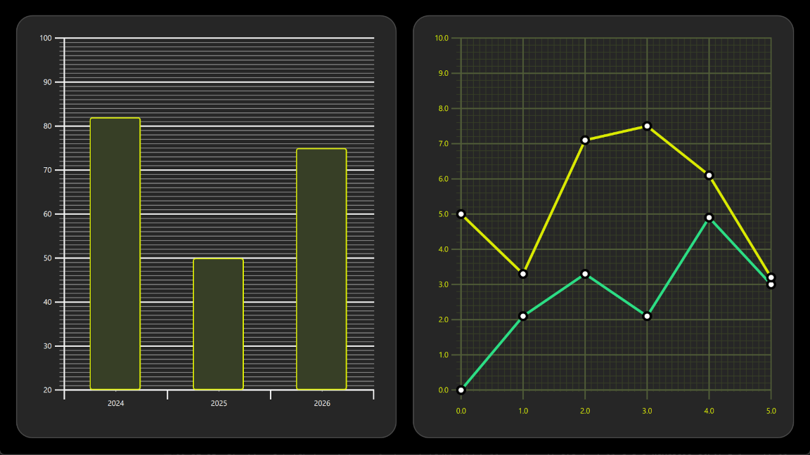
HelloGraphs shows how to make a simple 2D bar graph and line graph.
The following sections describe how to create a bar graph using BarSeries and a line graph using LineSeries.
Running the Example
To run the example from Qt Creator, open the Welcome mode and select the example from Examples. For more information, visit Building and Running an Example.
BarGraph
The first graph in the example is a bar graph. Creating it starts with a GraphsView component and setting the theme to one which is suitable on dark backgrounds. This theme adjusts the graph background grid and axis lines and labels.
 GraphsView {
     anchors.fill: parent
     anchors.margins: 16
     theme: GraphTheme {
         colorTheme: GraphTheme.ColorThemeDark
     }
     ...
To make this a bar graph, add a BarSeries. X axis of the series is BarCategoryAxis with 3 categories. We hide both the vertical grid and the axis lines. Y axis of the series is ValueAxis with visible range between 20 and 100. Major ticks with labels will be shown on every 10 values using tickInterval. Minor ticks will be shown on every 1 values using minorTickCount 9, which means that between every major ticks there will be 9 minor ones.
 BarSeries {
     axisX: BarCategoryAxis {
         categories: [2024, 2025, 2026]
         gridVisible: false
         minorGridVisible: false
     }
     axisY: ValueAxis {
         min: 20
         max: 100
         tickInterval: 10
         minorTickCount: 9
     }
     ...
Then data is added into BarSeries using BarSet. There are 3 bars, and we define custom bars color and border properties. These properties will override the possible theme set for the AbstractSeries.
 BarSet {
     values: [82, 50, 75]
     borderWidth: 2
     color: "#373F26"
     borderColor: "#DBEB00"
 }
LineGraph
The second graph of the example is a line graph. It also starts by defining a GraphsView element. Custom GraphTheme is created to get a custom appearance. GraphTheme offers quite a wide range of customization possibilities for the background grid and axis, which get applied after the colorTheme.
 GraphsView {
     anchors.fill: parent
     anchors.margins: 16
     theme: GraphTheme {
         readonly property color c1: "#DBEB00"
         readonly property color c2: "#373F26"
         readonly property color c3: Qt.lighter(c2, 1.5)
         colorTheme: GraphTheme.ColorThemeDark
         gridMajorBarsColor: c3
         gridMinorBarsColor: c2
         axisXMajorColor: c3
         axisYMajorColor: c3
         axisXMinorColor: c2
         axisYMinorColor: c2
         axisXLabelsColor: c1
         axisYLabelsColor: c1
     }
     ...
Custom Marker component is used to visualize the data points.
 component Marker : Rectangle {
     width: 16
     height: 16
     color: "#ffffff"
     radius: width * 0.5
     border.width: 4
     border.color: "#000000"
 }
The previous bar graph didn't define a separate SeriesTheme, so it uses the default theme. This line graph uses a custom theme with the desired line colors.
 SeriesTheme {
     id: seriesTheme
     colors: ["#2CDE85", "#DBEB00"]
 }
To make this a line graph, add a LineSeries. The first series defines axisX and axisY for this graph. It also sets the pointMarker to use the custom Marker component that was created earlier. Data points are added using XYPoint elements.
 LineSeries {
     id: lineSeries1
     theme: seriesTheme
     axisX: ValueAxis {
         max: 5
         tickInterval: 1
         minorTickCount: 9
         labelDecimals: 1
     }
     axisY: ValueAxis {
         max: 10
         tickInterval: 1
         minorTickCount: 4
         labelDecimals: 1
     }
     width: 4
     pointMarker: Marker { }
     XYPoint { x: 0; y: 0 }
     XYPoint { x: 1; y: 2.1 }
     XYPoint { x: 2; y: 3.3 }
     XYPoint { x: 3; y: 2.1 }
     XYPoint { x: 4; y: 4.9 }
     XYPoint { x: 5; y: 3.0 }
 }
The second line series is similar to the first. The axisX and axisY don't need to be defined as the graph already contains them. As this is second LineSeries inside the GraphsView, second color from the seriesTheme gets automatically picked.
 LineSeries {
     id: lineSeries2
     theme: seriesTheme
     width: 4
     pointMarker: Marker { }
     XYPoint { x: 0; y: 5.0 }
     XYPoint { x: 1; y: 3.3 }
     XYPoint { x: 2; y: 7.1 }
     XYPoint { x: 3; y: 7.5 }
     XYPoint { x: 4; y: 6.1 }
     XYPoint { x: 5; y: 3.2 }
 }
Files: